Moody WHOLE HOUSE REMODEL
Our clients purchased their Chevy Chase DC home because of its size, location and incredible potential. Built in 1936, the brick Colonial was expanded by the previous owners in 1995, but the rest of the home remained largely untouched. The original first floor layout was choppy and the spaces were disconnected, dated, and dysfunctional. We were entrusted to transform the house into our clients’ forever home – it had to be functional, but it also needed to reflect our clients’ eclectic style which leaned Scandinavian/Mid-modern with natural elements, moody colors and vintage nods thrown in. The entire first floor was touched during the renovation and included the kitchen, mudroom, powder room, entryway, living & dining rooms, and everything in between. An upstairs hall bath was also renovated to accommodate the growing family. This project exemplifies the transformative power of a whole house remodel, where every aspect of the home is carefully considered and redesigned to create a cohesive, functional, and personalized living space that truly reflects the homeowners’ lifestyle and preferences.
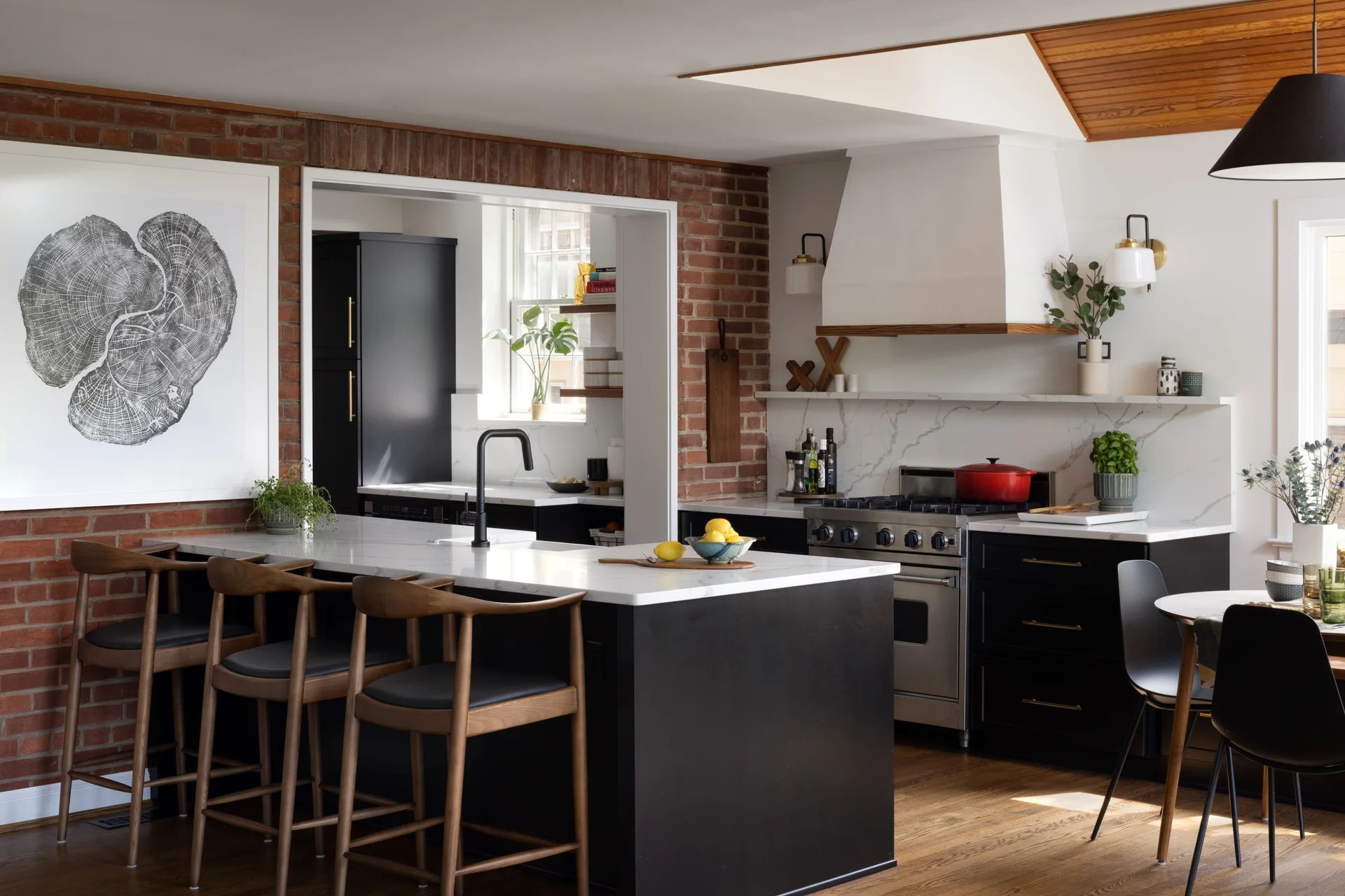
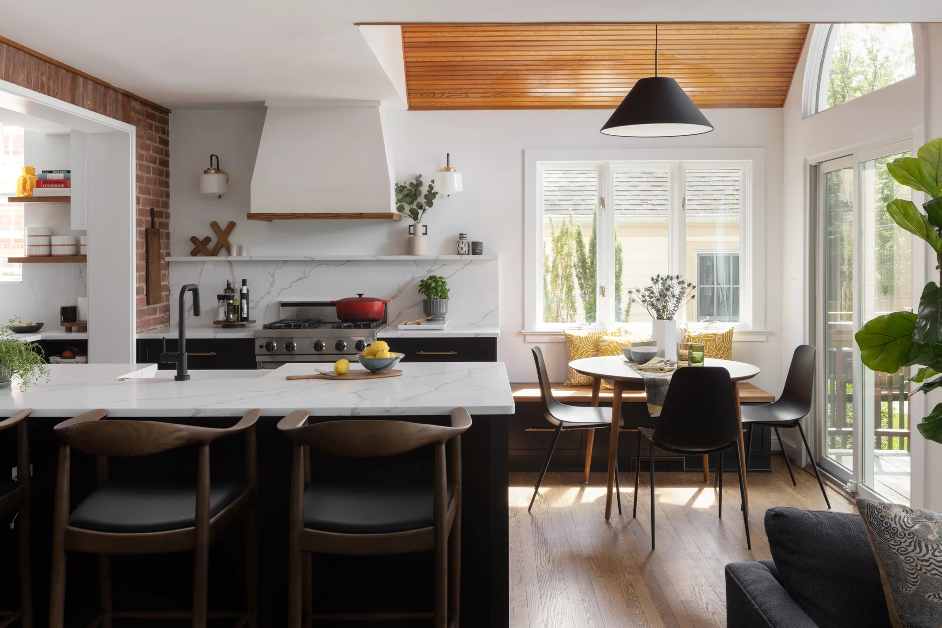
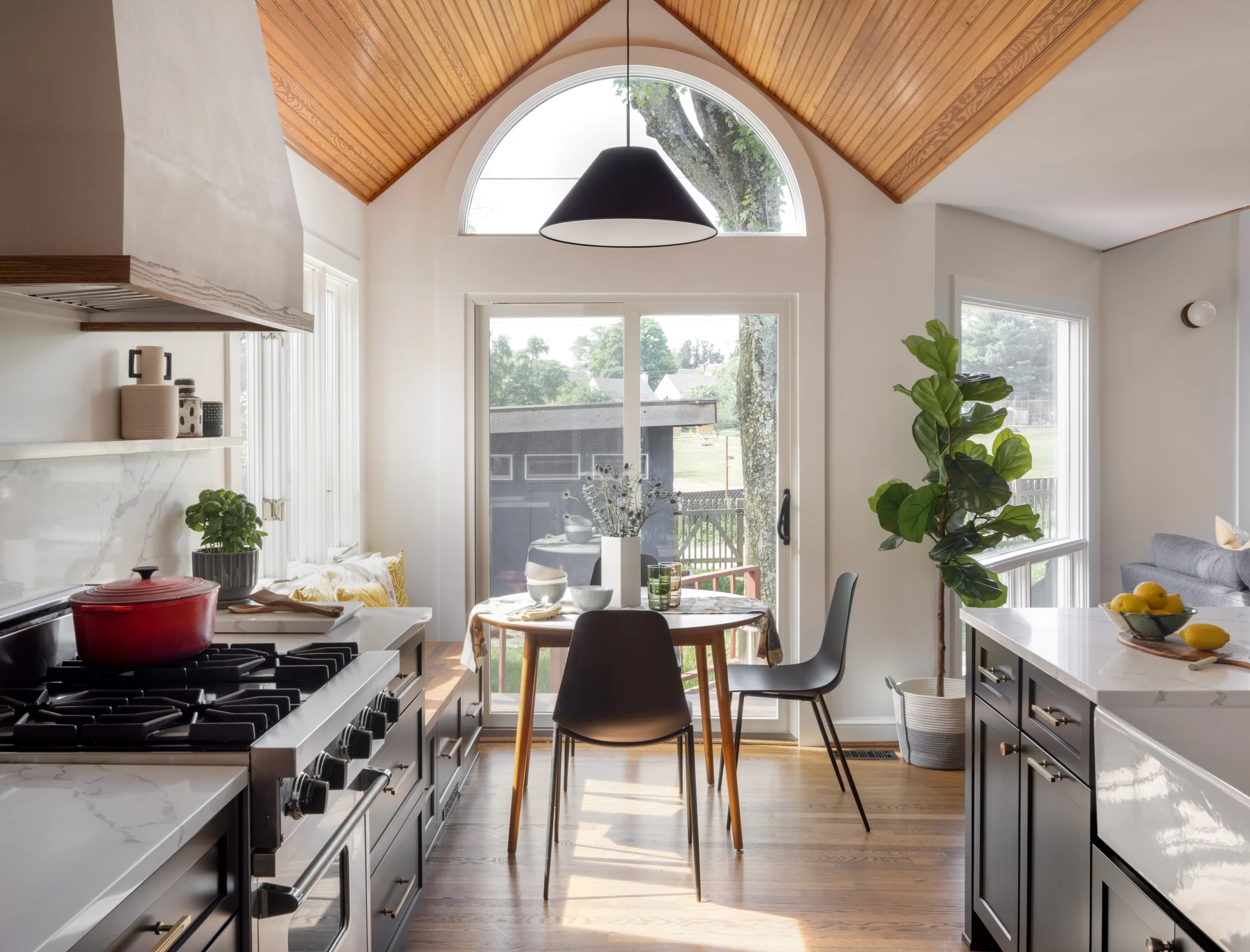
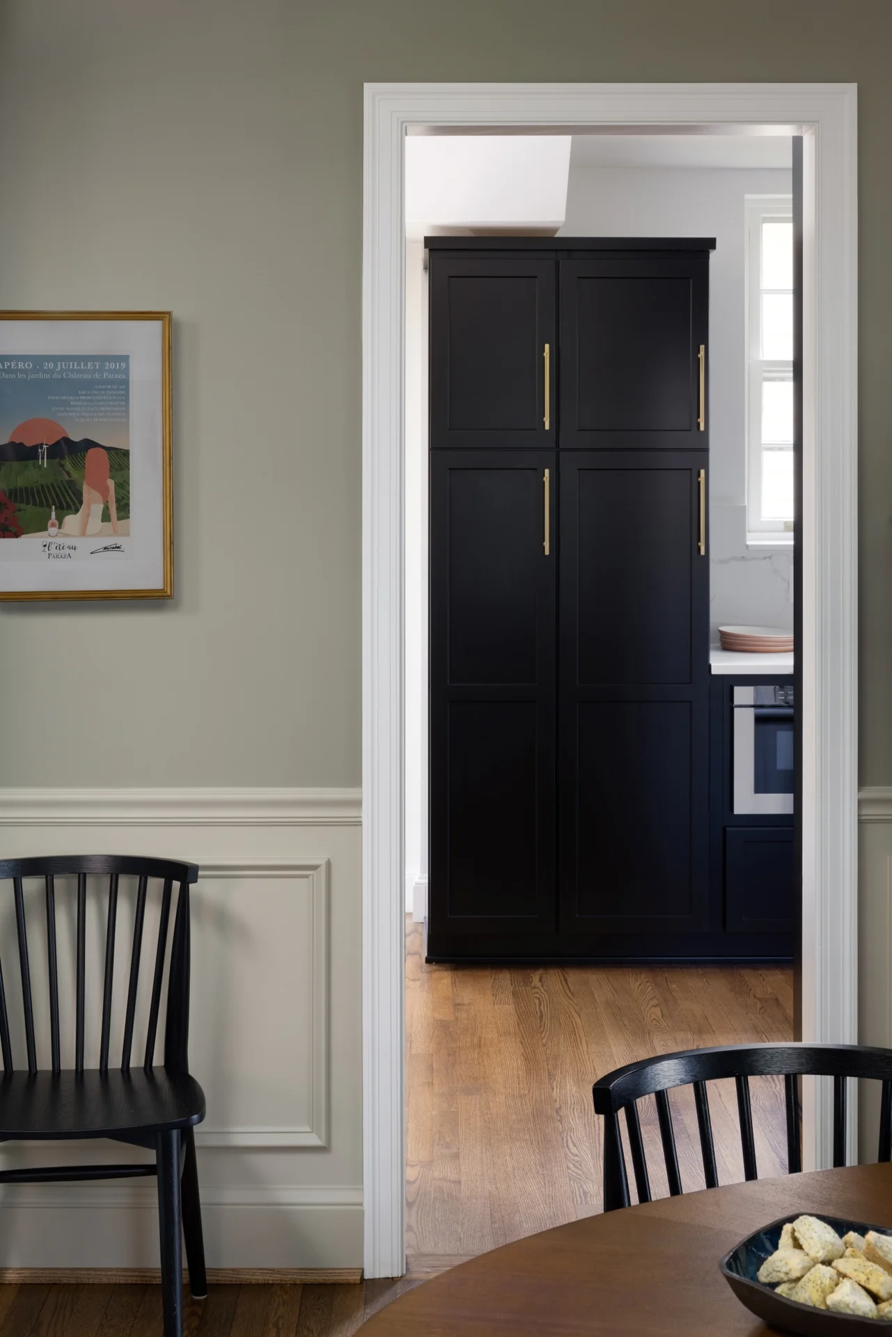
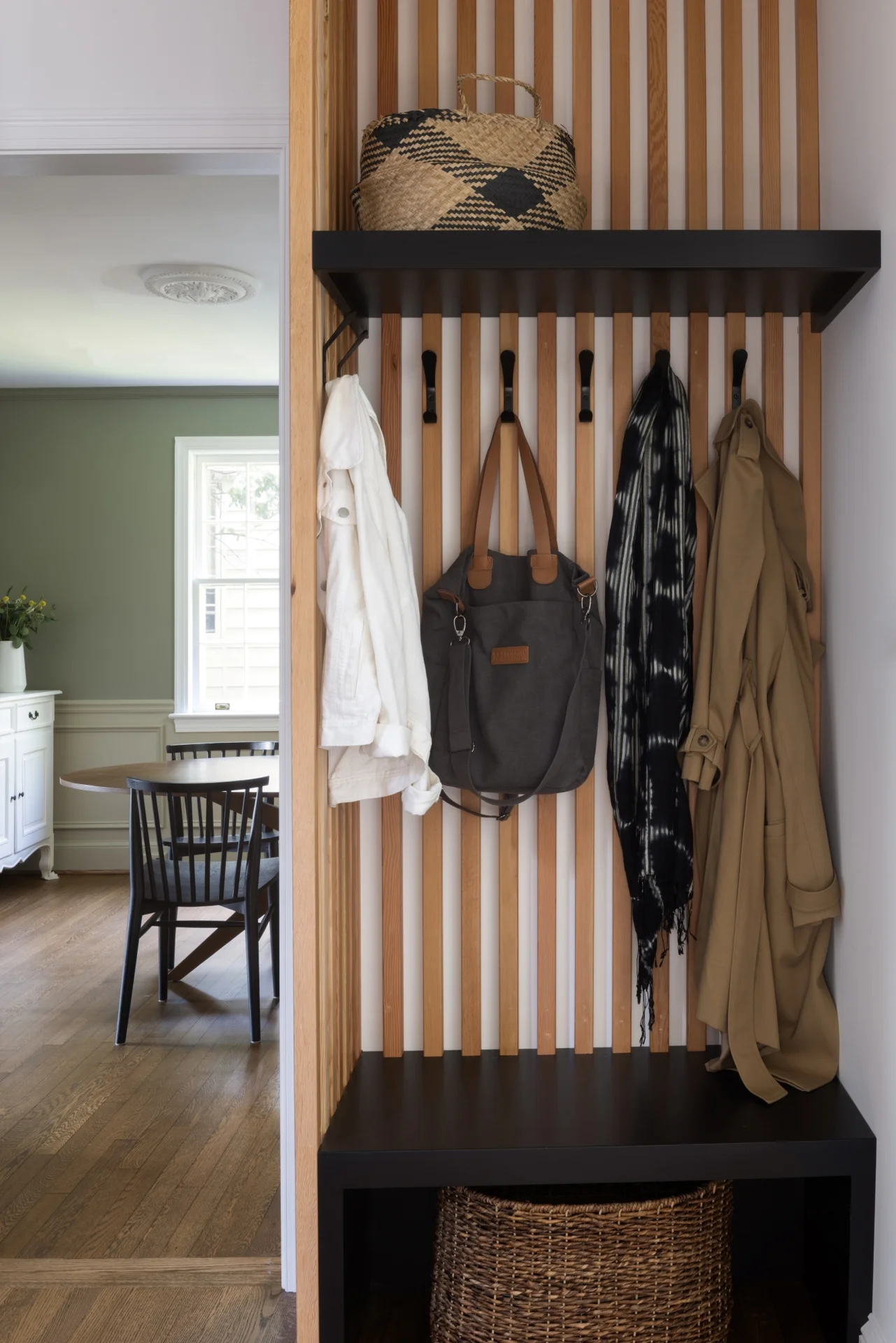
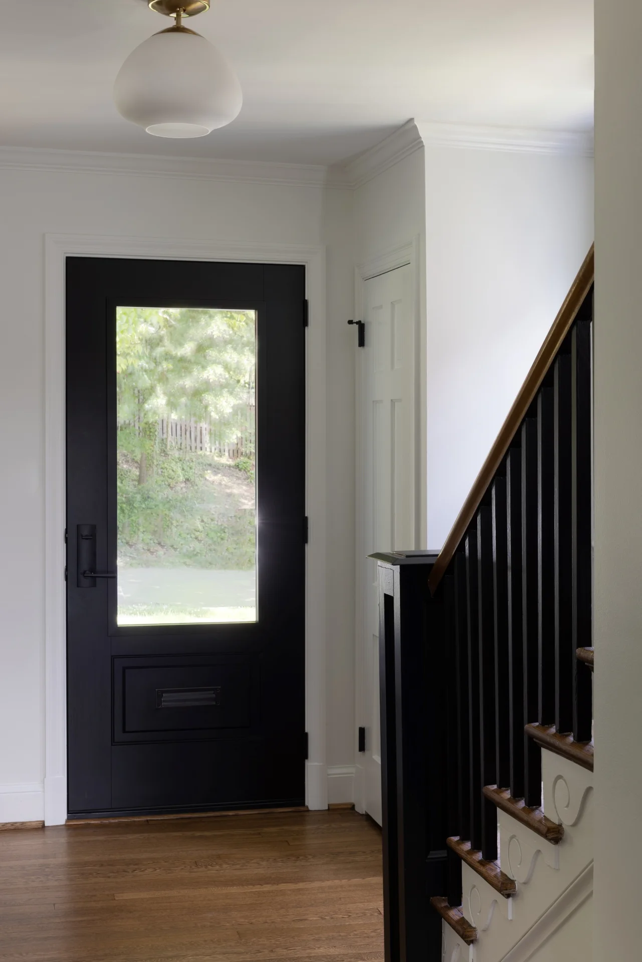
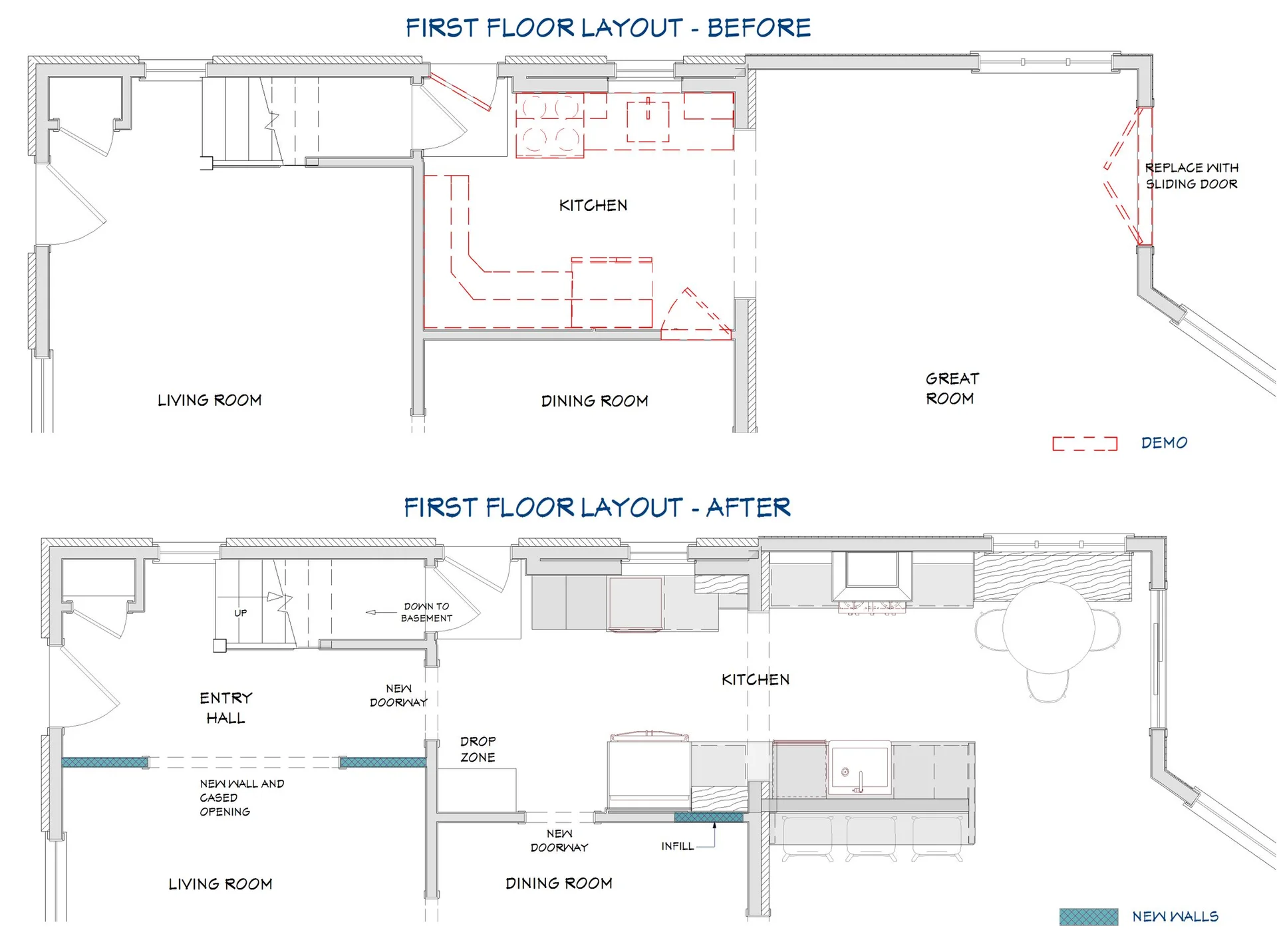
Expanding and updating the kitchen during this whole house remodel was our top priority – the new layout was designed to straddle the original house and the addition creating work zones rather than the traditional work triangles. The modified galley layout more than doubled their countertop area and storage space. Extending the kitchen into the addition took full advantage of the vaulted ceilings and light-filled space. To improve flow and connectivity, we opened up a wall between the old kitchen and the front entry hall providing a straight path from front door to the new mudroom/drop zone and kitchen beyond. A door from the dining room into the kitchen was shifted to allow for a more generous kitchen.
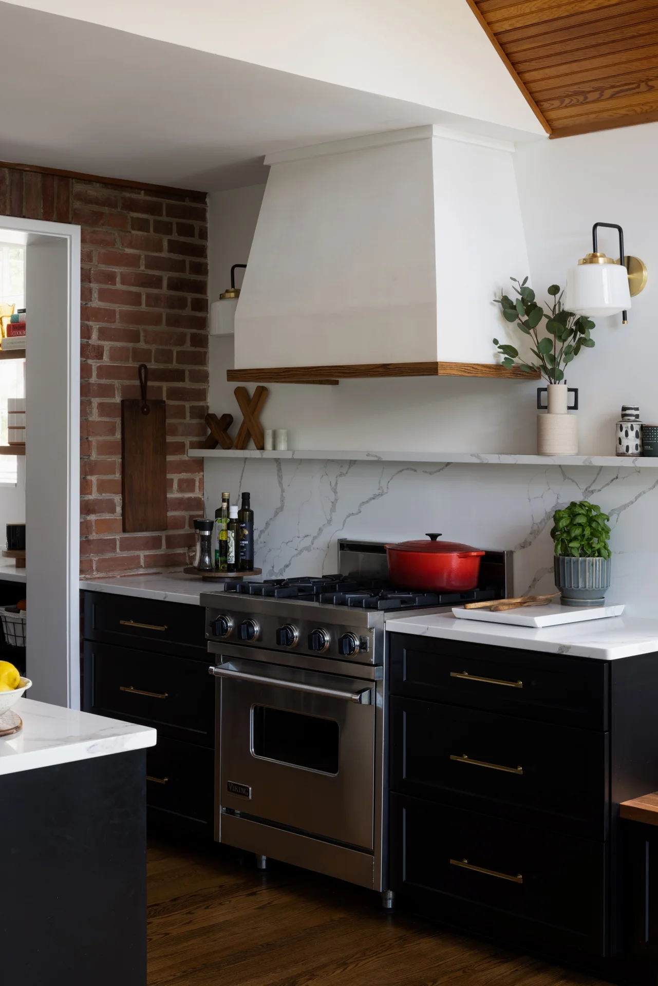
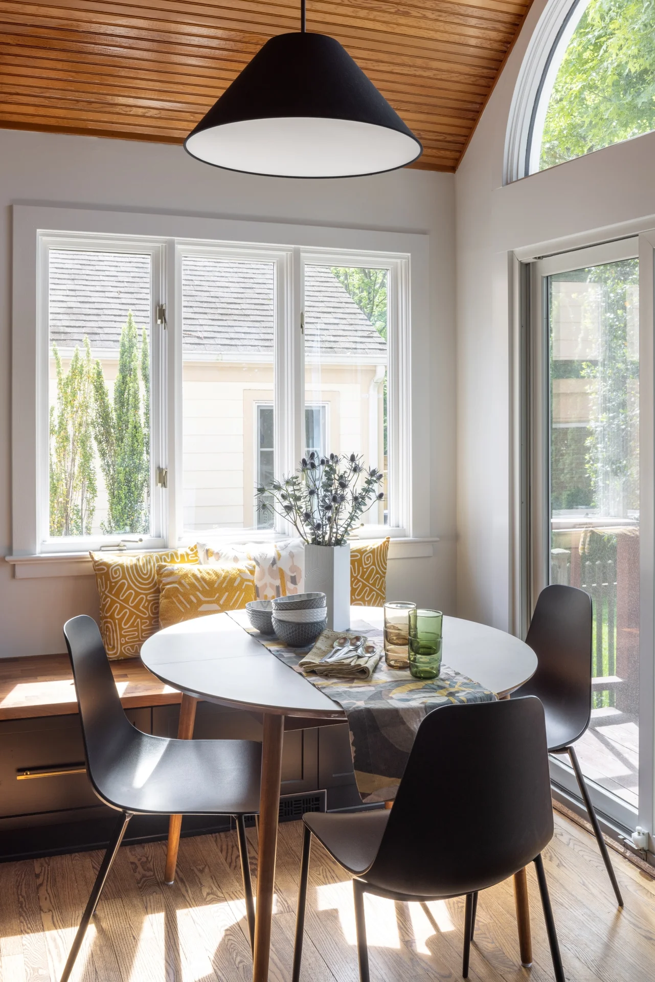
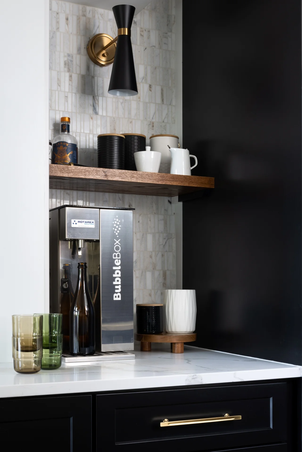
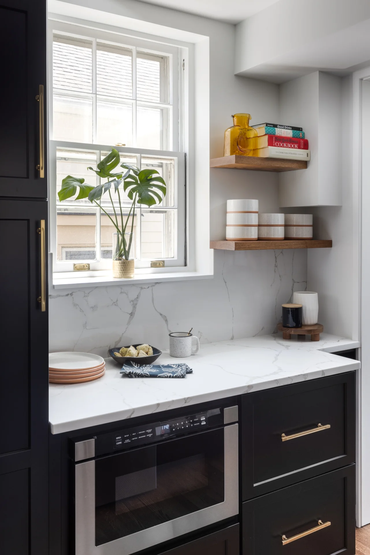
The beautifully veined Calacatta Eiffel quartz counters and backsplash provide visual contrast with the black cabinetry and keep the space from feeling too heavy. Stained wood is used throughout, from shelving, to trim, to the custom mudroom millwork; it brings in a natural element and helps unite all of the spaces. A hood with a custom Venetian plaster finish is flanked by sconces and provides a stunning focal point in the room. A deep nook is home to a ‘bubble box’ that dispenses cold sparkling or still water on demand – the marble tile backsplash further differentiates this beverage zone. The brushed brass hardware stands out against the dark cabinets and adds a touch of warmth. With seating for three at the counter and the inclusion of a breakfast area banquette (with drawers), the home is ideal for family time and relaxed gatherings with friends.
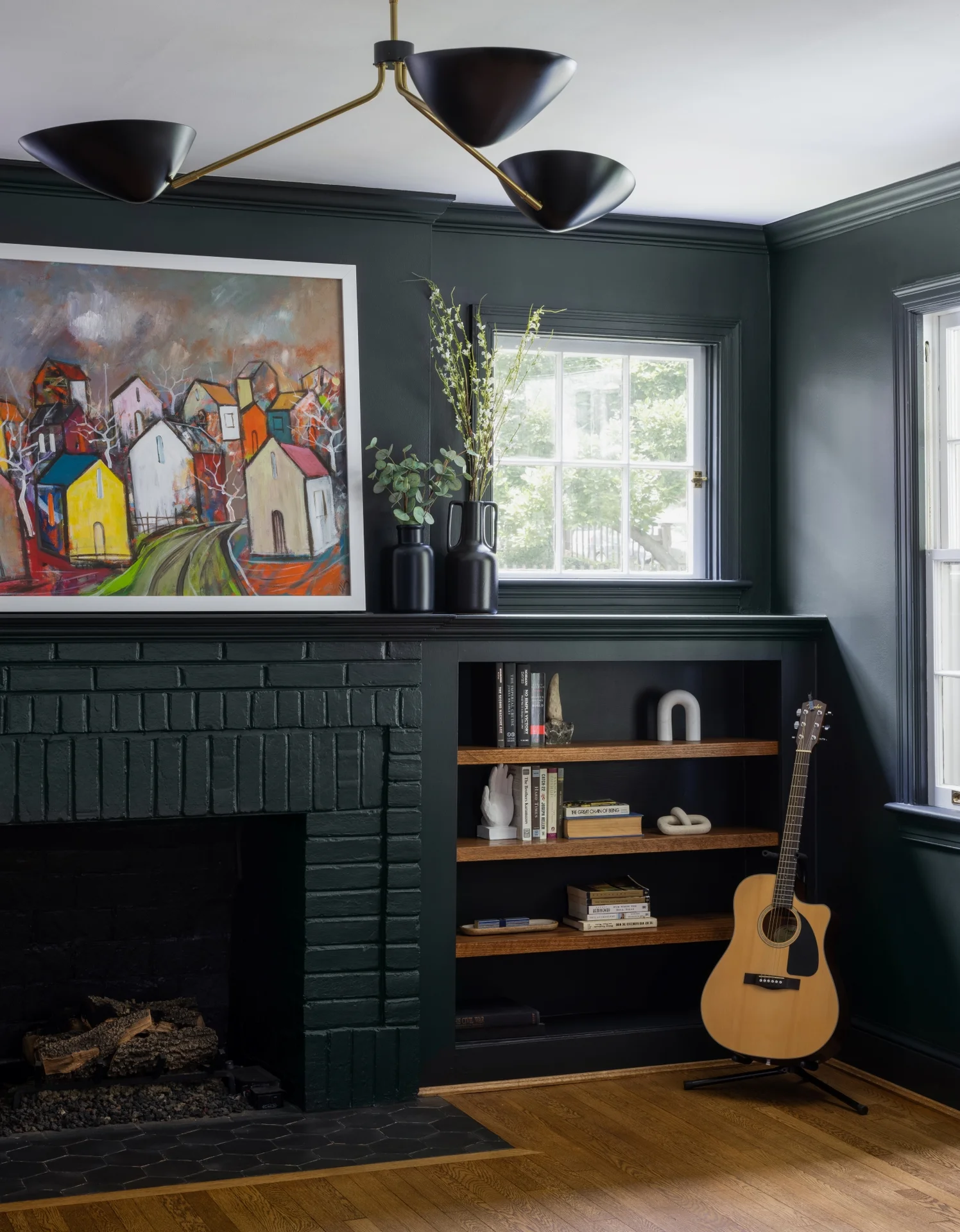
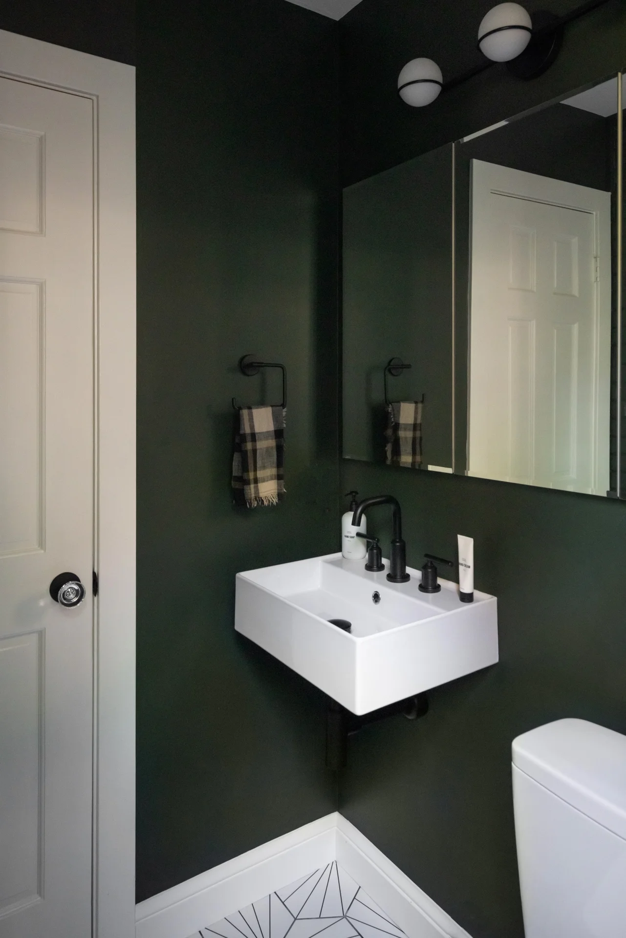
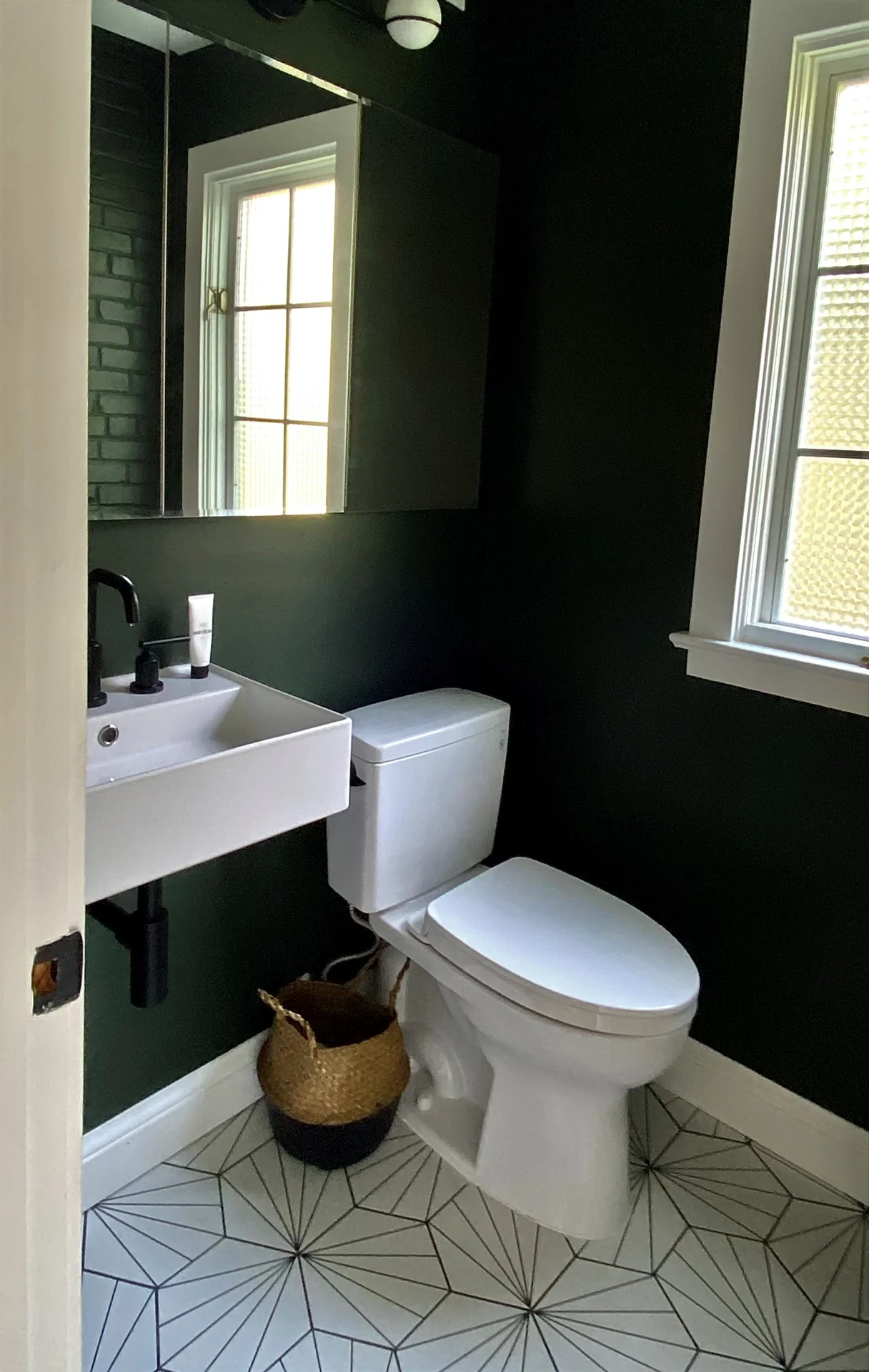
Design choices in the kitchen informed finish selections in the rest of the home. A small powder room just off the great room got a moody makeover, with deep olive walls, bold black & white floor tiles, and modern matte black fixtures. The front living room was painted a dramatic matte green-black from top to bottom and is nothing short of striking. Reclaimed oak shelves were used in the built-ins to add visual interest to the monochromatic space. The fireplace was updated with a hexagon tiled hearth, new fire brick, and a convenient gas log insert, ensuring that the updated living room will no longer be just a forgotten pass-through, but will become a comfy and atmospheric place to hang. The dining room connects the front of the house to the back and the spaces transition tonally from dark to light.
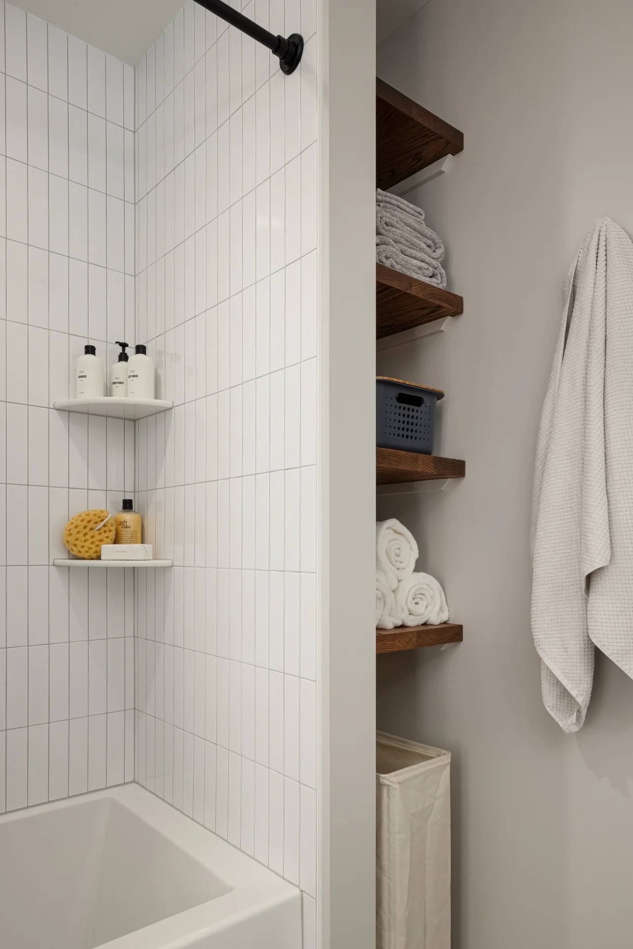
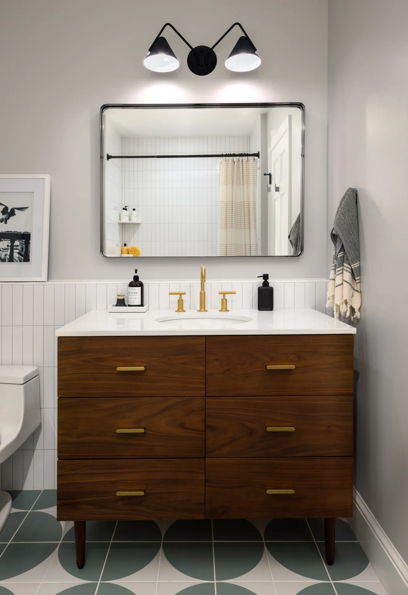
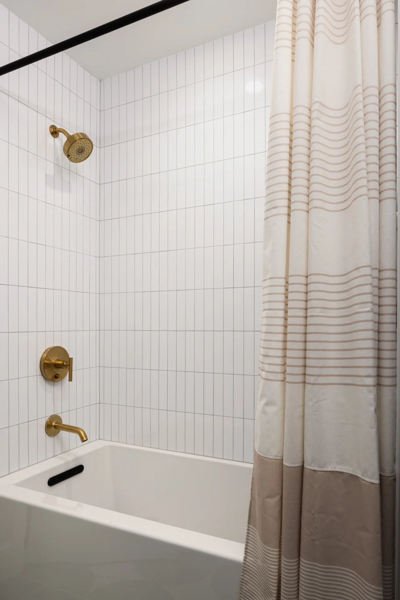
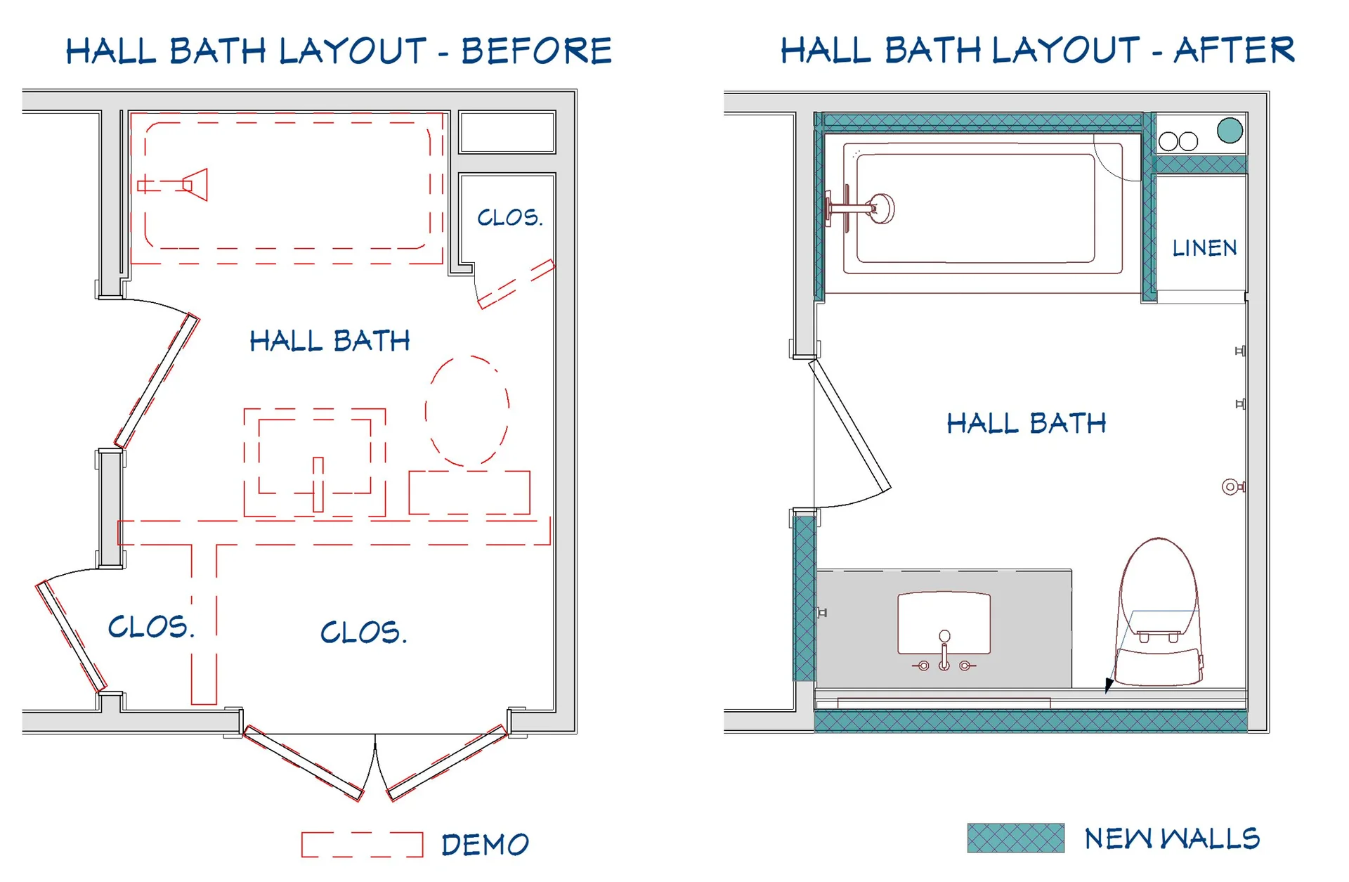
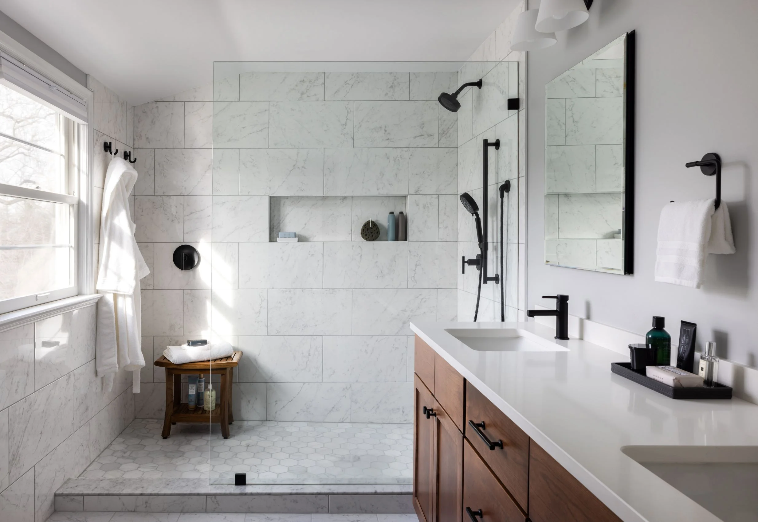
During demolition, it became apparent that the upstairs bathroom was in need of some serious TLC and the ideal time to renovate would be while the ceilings in the new kitchen were still open. We expedited the design and came up with a plan to expand the tiny bathroom into adjacent closet space to provide a roomier and more accommodating bathroom. The graphic floor tiles, mid-century style vanity, modern stacked subway tile, and black and gold accessories tie in perfectly with the home’s style. We created a ledge wall behind the vanity to provide additional space for toiletries and tiled it for easy cleaning and maximum durability.
From the beginning, our clients could see their home’s immense potential. We were able to turn their dream into reality and give them a forever home that reflects their unique and eclectic style.
